第一步: 整理清洗数据
第二步: 更新数据库
第三步: 数据的可视化
jupyter notebook
1
2
3
4
5
6
| update({id:1},{$set:{name:2}})
db.createCollection('Ita')
db.Ita.copyTo('Info')
data,type,name
charts.plot(series,show='inline',options=dict(title=dict(text='xxx')))
|
1
2
3
4
5
6
7
8
9
10
11
12
13
14
15
16
17
18
19
20
21
22
23
24
25
26
|
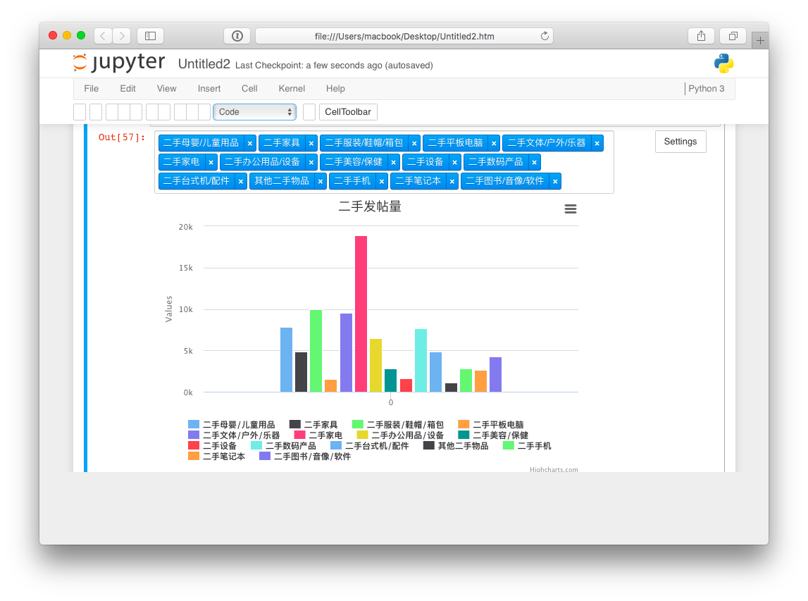
series = [
{
'name': 'OS X',
'data': [11],
'type': 'column'
}, {
'name': 'Ubuntu',
'data': [8],
'type': 'column',
'color':'#ff0066'
}, {
'name': 'Windows',
'data': [12],
'type': 'column'
}, {
'name': 'Others',
'data': [29],
'type': 'column'
}
]
series2 = [{'name': 'John','data': [5],'type': 'column'},{'name': 'John','data': [5],'type': 'column'}]
charts.plot(series, show='inline')
|
Aim
由于当时只爬了8k条数据。。所以直接用给的json
1
| mongoimport -d ceshi -c item_info "../data_sample.json"
|
Code
update 不要写成 updata…
成果
感想
基本也是逃模板啦..详情模板戳到上面那个页面就好
本来想把那个页面直接copy内嵌进来的..
发现根本加载不出就算了